MARKET INDICATORS AND MARKET TIMING
Introduction:

This website should help an amateur investor understand:
- Commonly used market indicators,
- How to use those indicators to try and time trades,
- How successful they can expect those strategies to be compared to traditional ‘buy and hold’ investing.
Moving Average Convergence/Divergence (MACD):

More information available at Investopedia.com
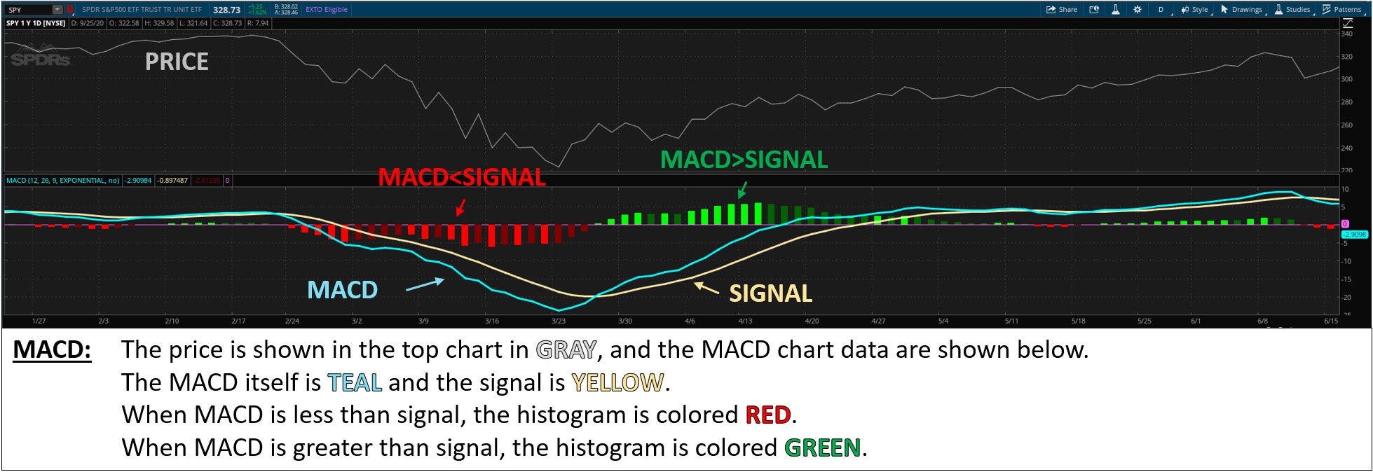
The Moving Average Convergence/Divergence (MACD) is an indicator that, essentially, compares the recent price of an investment to its slightly-less recent price.
Generally, this is done by subtracting the Exponential Moving Average (EMA) of the last 12 time periods (e.g. minutes, hours, days, weeks),
from the EMA of the last 26 periods to calculate the MACD value, and comparing that to a 9-Day EMA of the MACD itself (called the signal-line) — but you can ignore the math for now.
If the recent prices are higher than the historical prices the MACD will be above signal, which indicates that prices are rising.
Conversely, if the recent prices are lower than historical prices the MACD will be below signal negative, which indicates prices are falling.
By timing your purchases based on MACD and Signal crossovers you can (theoretically) get in at the bottom, ride the market up, and then get out at the top.
Relative Strength Index (RSI):

More information available at Investopedia.com
The Relative Strength Index (RSI) is based on comparing the recent gains and losses of an investment.
Generally, this is done by dividing the average gains for the last 14 trading periods (e.g. minutes, hours, days, etc.) by the average loss for the same periods
and doing some math to make the values end up between 0 and 100: RSI = 100-(100/(1+Gains/Losses))
If the RSI is high (e.g. above 70) the investment is said to be ‘overbought’,
which means that is has risen unusually high given its recent gains and losses
– this can be a warning of an imminent crash or correction.
Conversely, if the RSI is low (e.g. below 30), the investment is said to be ‘oversold’,
with opposite implications – a harbinger of a rally or rise.
By buying when RSI is low and selling when RSI is high, you can follow the age-old advice of ‘buy low, sell high’
with added insight into when a stock really is high or low.
Moving-Average Volatility Based Strategies:

More information available at Investopedia.com
An indicator fundamentally similar to RSI was invested by John Bollinger back in the 1980s.
This strategy compares the current price of the investment against the 20-day EMA of the price,
as well as the 20-Day EMA plus-or-minus two times the standard deviation of the investment across the same period.
Since the current price of an investment should generally be close to its recent average price,
the further it is away from that average the more likely it is to promptly move back toward the 20-Day EMA (via regression to the mean).
In a normally distributed range of prices, the price will be within two standard deviations of average about 95% of the time,
so if the price ever moves above or below the two ‘bands’ it can be an RSI-like harbinger of an imminent fall or rise in the investment price.
Ichimoku Cloud:

More information available at Investopedia.com
The Ichimoku Cloud indicator is older (1930s), computationally simpler, but procedurally far more complicated than the previous indicators.
The important components include:
| ITEM | MATH | NOTES |
|---|---|---|
| Tenkan-sen | 9-period high + the 9-period Low / 2 | |
| Kijun-sen | 26-period high + the 26-period Low / 2 | |
| Senkou Span A | Tenkan-sen + Kijun-Sen / 2 | Plotted 26-periods ahead |
| Senkou Span B | 52-period high + the 52-period Low / 2 | plotted 26-periods ahead |
| Kumo (aka 'Cloud') | The area between Span A and Span B |
When the current price is above the cloud, it indicates an upward trend in the price, and likewise, if it is below the cloud it indicated a downward trend.
Additionally, when Span A is above Span B it further supports the upward trend, and when Span A is below Span B it supports a downward trend
– and the larger the cloud is the stronger those signals are.
This complicated set of indicators can be used to try and predict whether an ongoing rally or route is likely to continue, stall, or reverse.
Hopefully after this introduction, stock market analyses charts will not be quite as intimidating or confusing.
This video was created by Tomislav Jakupec and available on Pixabay.
